Gail has known and worked with Cheryl for more than three years, visually capturing her own unique non-stuffy approach to small business accounting. We have got to know her both as our accountant, from the inside and as a brand, she has a big heart and works extremely hard around her family. She uses her understanding of what it is to be a busy parent and business owner to help other businesses balancing families and company finances.
Cheryl had always talked about changing her brand. There were no solid reasons to change until the recent collision of events; changing her own name, as she got married to James, the HMRC Making Tax Digital initiative and growing a team for the future of the business. This made it the perfect time to launch a new identity and future proof the brand, as a digital brand first and foremost.
As with many companies 4 or 5 years old, that have grown and become successful, Cheryl and James realised the business evolution meant that CH Accountancy and and its identity no longer reflected the broader activities or direction of the company. Many professional companies start using a founder’s name; when it comes to scaling and operating as a team, this can feel awkward, no longer representing all who work in the business.
We built on the strong values established with CH Accountancy, as approachable family led accountants and created a brand more suited to the digital world. You can still retain culture, personality and core values with a brand refresh, communicating what you stand for through a brand instead of one person, helping to unite a wider team and enabling you to recruit for what you are known for.
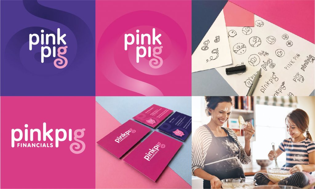
We purposefully kept the logo simple, using a soft but chunky typeface, featuring just the tail from the pig as a subtle nod to the cheeky character. We made the brand bolder, brighter and clearer, freshening up the colour palette and bringing in more screen legible fonts, whilst keeping the cheekiness with the Pink Pig character.
There is so much to a brand than just a logo. A brand is layered from many components; messaging, photography, illustrations, icons, colour palette, feedback from clients, suppliers. The logo should be a discreet partner to all these elements.
A brand without strong messaging is powering at half strength.
Logo, colours and images mean nothing unless you can explain how they connect back to what you do, how you do it and why. We developed not just one message but a range of interchangeable messages focussed around gaining back time to be with your family. Focussing on the reason why family businesses start for independence around family, not to be spending spare time bookkeeping.
We suggested a range of additional images, to incorporate the broader vision of the company, appealing to all family businesses, not just Mums. With James becoming part of the business and offering new financial services, the images needed to reflect families as a whole. The images still retain a light touch to hint back to the company’s feminine leadership and starting point.
Imagery does not have to be in the form of photography, illustrations are a great way to bring warmth to communication. The internet, streamed video and social media has brought a flood of imagery into our lives, illustration can be a way to mix it up. Having a library of images both photography and illustration means you can portray different scenarios, to appeal to a range of potential clients.
There is much more to come, we have pointed out a subtly new direction to communicate for the refreshed brand. As Pink Pig Financials grows, adds services and the requirements of clients change, this new identity has the flexibility to grow and evolve alongside.
GAS: Gail and Steve are happy to chat if you want to know more about refreshing a brand or futureproofing your brand in a digital environment.